

TL;DR:
- The correct choice of colors in clothing is based on personal color analysis and the application of balanced rules such as 60-30-10 and the "sandwich" method. These techniques help emphasize natural beauty and create a harmonious look, suitable for every seasonal type. Careful integration of fashion trends into one's personal color palette ensures a stylish and confident everyday look.
The method for choosing clothing colors is a systematic and personal approach that combines color analysis of skin tone, hair, and eyes with proven fashion rules to help you look harmonious and confident every day. The right choice of colors accentuates natural beauty and boosts confidence, while the wrong one can create a dull complexion and dark areas around the face. The tools we will work with include Johannes Itten's color wheel, the 60-30-10 rule, and the "sandwich" method. Each of these techniques can be applied immediately, without specialized fashion education.
How to Determine Your Color Season and Its Influence on Color Choice
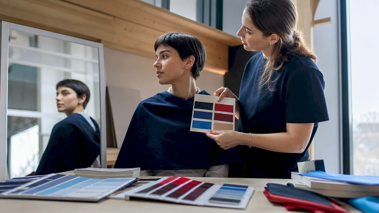
Color analysis is a methodology that links a person's physical characteristics to a specific palette of shades. The 12-season theory expands the classic division of spring, summer, autumn, and winter by adding subcategories such as "soft spring," "bright summer," and "deep autumn." Each season corresponds to a specific set of colors that harmonize with skin tone, eye color, and hair shade. The result is a personal color palette with over 120 shades, from which you can choose for every shopping trip.
To determine your season, consider the following signs:
- Skin Tone: Warm tones (yellowish or peachy) point to spring and autumn seasons. Cool tones (pink or bluish) correspond to summer and winter.
- Hair Color: Dark brown or black hair with a warm sheen is characteristic of the autumn type. Ash blondes and gray-haired women usually fall into the summer season.
- Eye Color: Green or brown eyes with warm highlights suggest autumn or spring. Gray and blue eyes with a cool sheen are typical for winter and summer.
- Wrist Veins: Greenish veins indicate a warm tone, while bluish or purplish veins indicate a cool tone.
Applications like Dressika automate the entire process and determine your seasonal profile with just a few photos. This is especially useful when you are unsure of your self-assessment.
Professional tip: Take the test in natural daylight, without makeup. Artificial lighting distorts skin tone and can lead you to the wrong season.
Once you know your season, building a color palette for clothing becomes significantly easier. Instead of buying clothes by intuition, you have a specific list of shades in which you look best.
What are the basic rules for combining colors in clothing?
Itten's color wheel is the primary tool for understanding color combinations in fashion. It divides colors into warm and cool, and the relationships between them define three main types of combinations.
Complementary colors are opposite each other on the wheel. Blue and orange, purple and yellow are classic examples. These combinations are dynamic and eye-catching but require careful balance of saturation.
Analogous colors are adjacent on the wheel. Green, blue-green, and blue create a calm and harmonious look. This combination is ideal for everyday outfits because it is not visually overwhelming.
Triadic colors form an equilateral triangle on the wheel. Red, yellow, and blue are the classic triad. This is a bold combination and requires experience to avoid looking chaotic.
| Combination Type | Example | Suitable Occasion |
|---|---|---|
| Complementary | Blue and orange | Special occasion, evening |
| Analogous | Green and turquoise | Everyday, work |
| Triadic | Red, yellow, blue | Bold look, event |
| Monochromatic | Shades of beige | Elegance, office |
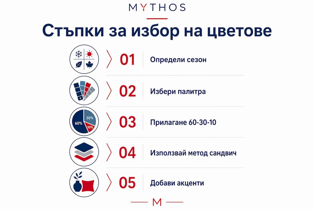
The 60-30-10 rule ensures a balanced look with a maximum of three colors in one outfit. The distribution is as follows: 60% main color (usually neutral), 30% secondary color, and 10% accent. This means that if you wear dark blue pants and a beige jacket, a small red bag completes the look without overpowering it.
Muted, dusty versions of colors are easier to wear daily than the bright, pure tones of the color wheel. Dusty pink combines with more items than fluorescent pink. This difference in saturation is key when choosing shades for work and everyday looks.
Professional tip: When unsure of a combination, check if the two colors have the same "temperature" tone. Warm brown with warm olive works. Warm brown with cool gray creates dissonance.
How does the "sandwich" method work for balance in clothing?
The "sandwich" method is a visual trick where repeating a color or texture at the top and bottom of an outfit creates a sense of harmony and completeness. If you wear white sneakers, adding a white blouse or a white accessory at the top "closes" the look and makes it deliberate, not accidental.
It's important to understand that the method doesn't require exact repetition. Close shades, similar textures, or equal visual weight achieve the same effect. Chunky black boots require a dark or saturated top to balance the silhouette. Light sandals in a neutral color allow for a lighter and airier top half.
Here's how to apply the method in practice:
- Color repetition: Brown shoes plus a brown belt or bag at the top.
- Texture repetition: Leather skirt plus leather details on the collar or bag.
- Tonal repetition: Dark blue jeans plus a dark blue collar or scarf.
- Visual weight: Chunky shoes plus a structured jacket or an oversized bag.
Visual balance through the "sandwich" method leaves a more lasting impression than seasonal fashion trends. While trends change every season, the principle of symmetry and repetition works regardless of the year or style.
The method is especially useful when combining women's clothing with bolder accents. If you want to wear a bright fuchsia skirt, repeat the shade in a small accessory at the top, such as earrings or a scarf. This makes the bold color appear intentional, not accidental.
How to integrate fashion trends into your personal color palette?
Fashion trends for spring 2026 include shades like fuchsia, lime, emerald, and ice blue. These colors can be integrated into your wardrobe without abandoning your personal palette. The key is to use them as the accent 10% in the 60-30-10 rule, not as a main color.
Here are specific ways to balance trends with your personal style:
- Trend as an accessory: If emerald green is trending, but it's not in your season, add it through a bag or shoes, not through a main garment.
- Adapted shade: If lime green is too bright for you, look for a more muted olive version that follows the trend but harmonizes with your tone.
- Trend in texture: Sometimes the trend is in the fabric, not the color. A satin blouse in a neutral color follows fashion without compromising your palette.
| Trend Color 2026 | Suitable for Season | Integration Method |
|---|---|---|
| Fuchsia | Winter, bright summer | Accent bag or shoes |
| Lime | Spring, bright spring | Scarf or jewelry |
| Emerald | Autumn, deep winter | Blouse or collar |
| Ice blue | Summer, soft winter | Main garment or dress |
Basic wardrobes built around neutral colors make integrating trend elements easy and stylish. When you have a solid foundation of beige, dark blue, and gray, every seasonal accent fits effortlessly. Conversely, a wardrobe built entirely of bright colors leaves no room for new trends.
Following fashion trends confidently doesn't mean blindly following every new color wave. It means knowing which trends work for you and adapting them to your existing palette. This selectivity is the hallmark of true personal style.
Color accents like bags or jewelry should be in reasonable quantities. One ornament in an accent color is enough. More than two accent elements in different colors disrupt the harmony of the look.
Key Takeaways
The correct method for choosing clothing colors combines personal color analysis, the 60-30-10 rule, and the "sandwich" method to achieve a harmonious and confident look.
| Point | Details |
|---|---|
| Determine your color season | Use the 12-season theory and apps like Dressika for a personal palette. |
| Apply the 60-30-10 rule | Distribute colors in the outfit as 60% main, 30% secondary, and 10% accent. |
| Use the "sandwich" method | Repeat a color or texture at the top and bottom of the outfit for visual balance and completeness. |
| Prefer muted shades | Dusty versions of colors are easier to combine and look more elegant daily. |
| Integrate trends moderately | Add trend colors as accessories, not as main garments, if they are not in your color season. |
Why most women choose colors the wrong way
I have worked with many women who buy clothes based on their mood or what looks beautiful on the hanger. The result is a wardrobe full of clothes that don't match each other and don't make their owner look good. The problem is not a lack of taste. The problem is a lack of system.
My observation is that most women skip the color analysis step and directly jump to the rules of combination. But rules only work when you know your starting point. If you don't know whether you are a warm or cool type, the 60-30-10 rule gives you structure but doesn't tell you which 60% to choose.
The other mistake I constantly see is the fear of color. Women who wear only black and gray because "it's safe." Safe isn't bad, but it's boring and misses out on huge potential. A neutral base is a correct strategy. But without an accent color, it remains incomplete.
My advice is to start with one bold accent in a color you know is in your season. Just one. See how you feel. The reaction of the people around you will tell you more than any theory. Style is built with practice, not just with reading.
— Milen
Discover your color palette with Mythos

Mythos offers women's clothing in a wide range of neutral bases, supporting shades, and bold accent colors, selected according to current trends for 2026. The collection is structured to easily build a wardrobe according to the 60-30-10 rule, without a long search. Dresses, blouses, and sets are available in shades suitable for every color season, from muted olive to bright emerald. Quality fabrics and modern design make every look complete. Browse the collection and find the right colors for your style.
Frequently Asked Questions
What is a color season and how do I determine it?
A color season is a category that describes which palette of shades harmonizes with your skin tone, hair, and eyes. You determine it by analyzing the warm or cool tone of your skin and using applications like Dressika, which offers over 120 personalized shades.
How is the 60-30-10 rule applied in everyday outfits?
The rule distributes colors in an outfit as 60% main color, 30% secondary, and 10% accent. For example, dark blue pants with a beige jacket and a red bag follow this exact distribution.
What is the "sandwich" method in dressing?
The "sandwich" method repeats a color, texture, or visual weight in the upper and lower parts of an outfit to create a harmonious and complete silhouette. Exact matching is not necessary; similar shades or textures achieve the same effect.
What are the fashionable colors for spring 2026?
Current colors for spring 2026 include fuchsia, lime, emerald green, and ice blue. It is recommended to integrate them as accent elements, rather than main garments, if they are not in your color season.
How to combine bold colors without overpowering the look?
Limit bold colors to 10% of the outfit, usually through an accessory like a bag, shoes, or jewelry. One ornament in an accent color is enough for an impactful look without clutter.
0 comments